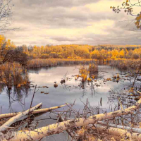
Arches NP & Goblin State Park
 El Gato
Registered Users Posts: 1,242 Major grins
Two more color images from my Sept road trip.
This first one is from Arches NP.
Sunsets, as I have mentioned previously were pretty interesting. One plus to having all the smoke and cloud cover.
The arch designed by Mother Nature...not by the state of Florida Visitors Bureau. 🙂

This "vacation pic" is the entrance road to Goblin State Park, about 100 miles west of Arches (worth the drive!)

1
Comments
Nice work, my friend, with both shots. # 2 just keeps sucking you in to heart of the image.
Thank you Tom!
I appreciate your comment and perspective. Gotta love those leading lines. Nice about this local, one can venture out into the middle of the road and take one's time in setting up the shot. First, there is no one around and secondly, you can hear a car approaching long before it becomes critical to move out of the road.
Thank again Tom.
El Gato
www.globaltrekk-photos.com
Love first one. If mine, I take off 1.5 inch from bottom. Put focus on best part.
For second one, colors are sweet but seems like lot of wide angle distortion and not being symmetrical also not working, Although bold, perhaps we are conditioned to look at shots in middle of the road placing road right in center of the shot.
Taz...
Happy New Year!
Thanks for your input and feedback...I am always looking to construct a better image. Feedback such as you have provided certainly contributes to that goal!
El Gato
www.globaltrekk-photos.com
I like both, but as Tom said #2 has a great perspective that draws you in. Well done.
www.mind-driftphoto.com
Love them both. First seems too soft of focus. Tight crop shot? The comp seems well thought out.
Second is very well done. The background hill on the far right draws my eye to it and detracts a bit from the subject(s). I'd crop that ridge out to concentrate the eye down the road and to the main background. But great shot!
"You miss 100% of the shots you don't take" - Wayne Gretzky
Good ones, Gato.
Gallery: http://cornflakeaz.smugmug.com/
Thank you David & Don!!
Dave, I like your crop suggestion, makes the viewer focus more on the vanishing point within the image.
El Gato
www.globaltrekk-photos.com