Options

Snuff out my candles

InsuredDisasterInsuredDisaster Registered Users Posts: 1,132 Major grins
edited September 17, 2010 in People
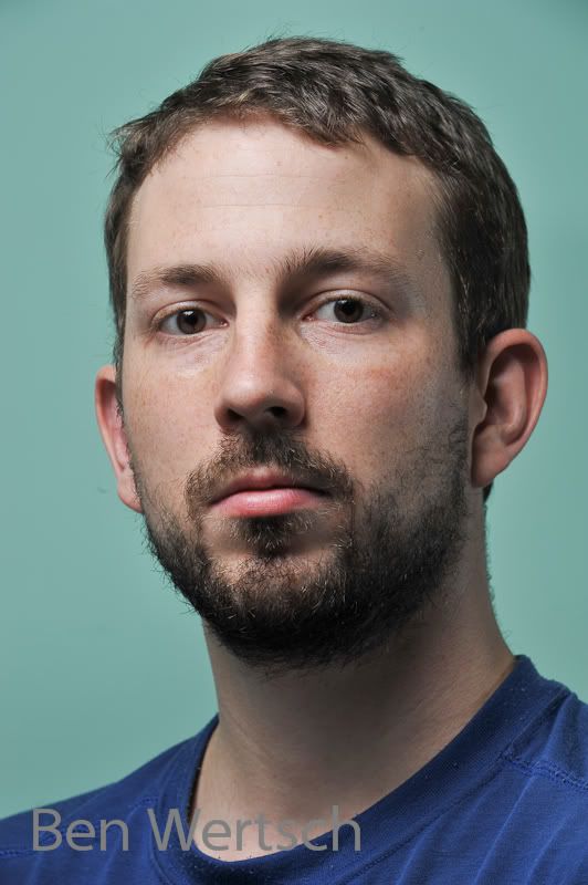
I recently acquired a shoot through umbrella and have been playing with it a bit. Owing to the scarcity of super models laying around the house, I had to pose for the camera.

Anyway, I'm interested in what you think of the lighting here. I think it was a tad underexposed and this is something I notice with a lot of my flash photography lately. Not sure why. Something I neeed to work on. This one was brought up about .66 stops in Lightroom (exposure setting) but nothing else was done.


Shoot through umbrella up and camera left aiming down around 45 degrees. Reflector in my lap. Second speedlight zoomed in a bit on Camera right to add a bit of fill.

What do you think? I think next time I'll try to expose a bit differently, but with the flash stuff I think I'm having a bit of trouble reading the histogram. Anyway, any comments would be appreciated here.

SelfPortrait-055.jpg
«1

Comments

  • Options
    damonffdamonff Registered Users Posts: 1,894 Major grins
    edited September 10, 2010
    I like it. It's very even.
  • Options
    InsuredDisasterInsuredDisaster Registered Users Posts: 1,132 Major grins
    edited September 10, 2010
    Thanks. Its not too even or anything is it? I've seen some other comments for pictures saying that the lighting was too even and the picture was flat.
  • Options
    B RockB Rock Registered Users Posts: 181 Major grins
    edited September 11, 2010
    I think even is ok for first starting out. Learning how to light evenly and getting a proper exposure is a great tool to learn at the beginning. Everything else after that is just up to your own creativity. If you are using a meter make sure you dial your flash up a stop or 2 past that reading. The shoot thru umbrella is eating up some of your light so you have to compensate for that. Also make sure that your lcd is turned all the way down on brightness. They are a horrible representation of the final photograph once it is actually on your computer. I can't really tell what it looks like on this work monitor that is going out. But I will look when I get home. What was your reasoning to add the reflector below you? Did you try it without the reflector first?
  • Options
    HinsonHinson Registered Users Posts: 219 Major grins
    edited September 11, 2010
    Actually, the lighting is quite nice for a portrait. However the color balance is way off which makes it hard to judge. Was the wall behind you actually green or was it gray as I suppose?
    Serving Him by Serving Others
    www.Jerrywhitephotography.com
  • Options
    InsuredDisasterInsuredDisaster Registered Users Posts: 1,132 Major grins
    edited September 11, 2010
    Thank you.

    The wall was actually green. I don't have a background at this time, and that's the color of the walls in my place. Does the WB on my face look ok?
  • Options
    reyvee61reyvee61 Registered Users Posts: 1,877 Major grins
    edited September 11, 2010
    Nicely done Closed loop portrait, I gather your umbrella is a a good size?
    Yo soy Reynaldo
  • Options
    HinsonHinson Registered Users Posts: 219 Major grins
    edited September 11, 2010
    Thank you.

    The wall was actually green. I don't have a background at this time, and that's the color of the walls in my place. Does the WB on my face look ok?

    On my monitor, it appears a bit on the green side. Possibly spill from wall color reflection.
    Serving Him by Serving Others
    www.Jerrywhitephotography.com
  • Options
    InsuredDisasterInsuredDisaster Registered Users Posts: 1,132 Major grins
    edited September 11, 2010
    B Rock wrote: »
    I think even is ok for first starting out. Learning how to light evenly and getting a proper exposure is a great tool to learn at the beginning. Everything else after that is just up to your own creativity. If you are using a meter make sure you dial your flash up a stop or 2 past that reading. The shoot thru umbrella is eating up some of your light so you have to compensate for that. Also make sure that your lcd is turned all the way down on brightness. They are a horrible representation of the final photograph once it is actually on your computer. I can't really tell what it looks like on this work monitor that is going out. But I will look when I get home. What was your reasoning to add the reflector below you? Did you try it without the reflector first?


    Yes, I felt that there was some unsightly shadows on my neck and all without the reflector. I was trying to go for an overall even lighting, something you'd find from a studio. Perhaps what one might consider "safe" lighting.

    I've turned down the LCD brightness but for this shot, i just was shooting tethered so i didn't have to check the LCD after each shot.

    I'm really excited here to be trying out light modifiers and really get into the business of lighting something with a strobe. Seems really different what i can do vs available lighting. But I'm having some trouble with exposures a bit.
  • Options
    InsuredDisasterInsuredDisaster Registered Users Posts: 1,132 Major grins
    edited September 11, 2010
    reyvee61 wrote: »
    Nicely done Closed loop portrait, I gather your umbrella is a a good size?


    Thank you.

    It is a medium I think. 48 inch?

    Now i need to study closed loop, haha.
  • Options
    InsuredDisasterInsuredDisaster Registered Users Posts: 1,132 Major grins
    edited September 12, 2010
    Hinson wrote: »
    On my monitor, it appears a bit on the green side. Possibly spill from wall color reflection.


    A "bit" or "way off?"

    it looked ok to me so I'm wanting to check. Maybe I should start shooting with a gray card to get a more appropiate WB when i start something like this. It looked ok, so I didn't really bother with the WB in post. Maybe I should have a look at that when I get home.
  • Options
    HinsonHinson Registered Users Posts: 219 Major grins
    edited September 12, 2010
    A "bit" or "way off?"

    it looked ok to me so I'm wanting to check. Maybe I should start shooting with a gray card to get a more appropiate WB when i start something like this. It looked ok, so I didn't really bother with the WB in post. Maybe I should have a look at that when I get home.

    I would have to say 'a bit' rather that way off. If the color of the background matches your wall, then it is reflection. If the color is off, then it's the color balance. I can't get a flickr link to work or I'd post a corrected image. My monitor is calibrated so I'm fairly sure of the color balance.
    Serving Him by Serving Others
    www.Jerrywhitephotography.com
  • Options
    InsuredDisasterInsuredDisaster Registered Users Posts: 1,132 Major grins
    edited September 12, 2010
    Hinson wrote: »
    I would have to say 'a bit' rather that way off. If the color of the background matches your wall, then it is reflection. If the color is off, then it's the color balance. I can't get a flickr link to work or I'd post a corrected image. My monitor is calibrated so I'm fairly sure of the color balance.


    I've calibrated mine with the Spyder3 and while I'm not saying mine is correct(it may be off, I'm not really sure), I guess I don't notice the WB that much. I'd like to see what you think it should be. Hope you get the link working.

    I'll also really look into some sort of grey card to double check WB in the future, since I'm guessing my eyes just don't pick up the color difference that much.
  • Options
    HinsonHinson Registered Users Posts: 219 Major grins
    edited September 12, 2010
    Mine may not be perfect either. Try this. (assuming you have PS) Open the image and make the following levels adjustment in the red channel.
    11
    1.13
    230

    That's real quick but it will give you an idea of what looks a tad better on my monitor.
    Serving Him by Serving Others
    www.Jerrywhitephotography.com
  • Options
    InsuredDisasterInsuredDisaster Registered Users Posts: 1,132 Major grins
    edited September 12, 2010
    Hinson wrote: »
    Mine may not be perfect either. Try this. (assuming you have PS) Open the image and make the following levels adjustment in the red channel.
    11
    1.13
    230

    That's real quick but it will give you an idea of what looks a tad better on my monitor.

    Not seeing a whole lot of difference, or it goes the wrong way.

    Are all three numbers the input levels on the red channel? If I do that, the image looks really bad.

    If on the other hand I put the highlight output level to 230, the image looks ok, but not that much difference. I'm a bit confused.
  • Options
    HinsonHinson Registered Users Posts: 219 Major grins
    edited September 12, 2010
    Here's what I did. (CS 4)
    Open image
    levels adjustment mask (or image/adjustments/levels)
    select red channel
    set:
    Black point to 11
    Gray point to 1.13
    White point to 230

    With these settings, the wall is still green but the skin looks more natural.
    Serving Him by Serving Others
    www.Jerrywhitephotography.com
  • Options
    InsuredDisasterInsuredDisaster Registered Users Posts: 1,132 Major grins
    edited September 12, 2010
    Looks pretty red to me. I've posted what I did. Does it look natural to you? If so, one of our monitors is way off!
    SelfPortrait-055-Edit-2.jpg
  • Options
    HinsonHinson Registered Users Posts: 219 Major grins
    edited September 12, 2010
    While it still could use some tweaking, it does appear better than the original. I wish someone else would chime in for a third opinion. This one appears more red than the one I did. Here is the flickr link, http://www.flickr.com/photos/30632959@N02/4980992916
    Serving Him by Serving Others
    www.Jerrywhitephotography.com
  • Options
    reyvee61reyvee61 Registered Users Posts: 1,877 Major grins
    edited September 12, 2010
    Looks pretty red to me. I've posted what I did. Does it look natural to you? If so, one of our monitors is way off!
    SelfPortrait-055-Edit-2.jpg


    It does look rather on the red side to me as well
    Yo soy Reynaldo
  • Options
    reyvee61reyvee61 Registered Users Posts: 1,877 Major grins
    edited September 12, 2010
    Hope you don't mind, I made a few tweaks to the contrast and used a remove color cast filter:

    1004673857_RKqL4-L.jpg
    Yo soy Reynaldo
  • Options
    InsuredDisasterInsuredDisaster Registered Users Posts: 1,132 Major grins
    edited September 13, 2010
    No worries about reposting and editing. I really, really appreciate the help and comments. Today I set up the lights again to test the white balance. Since I have a really tiny place I shoot tethered so that I can see the images without running over the to camera. Last time I set the camera to JPG for faster rendering but this time I switched back to RAW so that I have more WB info.

    Some more info should it interest you. D700 with 70-200. FYI, there was some vignetting with this combo even at 105 and 135. LR took care of this with the auto lens profile feature.
    ISO200, 1/250th f2.8 (I wanted a really shallow DOF here) Of course, its on a tripod, so not exactly sure where the focus point was.

    Lighting. Key was SB600 in a shoot through about 45 degrees high, pretty close to my face. Power was 1/16th. Fill light was a bit higher this time (probably about 60 something inches high) and pretty much 90 degrees to the camera right shoot through the snap on dome diffuser @ 1/64th power. (Sorry, didn't measure distances) I felt I needed some additional fill under my chin so again I used the reflector.

    To test the white balance I held up a sheet of white copy paper and then used the LR point dropper. The result ended up being a bit cooler and a bit more towards magenta than the AUTO WB selected. Looks ok to me so went with the white sheet result.

    Increased the blacks and clarity then decreased the vibrance a slight bit. Finally, increased the green luminance to 100% to try to turn the green wall as close to white as possible, since I'd like to use this photo for a work mug shot rather than the onces the chimp with a camera takes.

    Please tell me what you think.
    SelfPortrait2WB-056-1.jpg
  • Options
    reyvee61reyvee61 Registered Users Posts: 1,877 Major grins
    edited September 13, 2010
    I see what your saying about the WB leaning towards magenta but I like the way this came out and the exposure looks great on my end.
    Do you use Capture NX2?
    For .nef, there is no better in my opinion.....
    I think this will be great for your work mug shot
    Yo soy Reynaldo
  • Options
    InsuredDisasterInsuredDisaster Registered Users Posts: 1,132 Major grins
    edited September 13, 2010
    I'm going to the photo market today. Basically its a gear junkies dream street. I'll pick up a grey card. Should help with the WB thing.

    Thanks. I like this one better than the first one! Just hope the WB is better.


    Oh sorry, I use LR3 now. I use it as I've been using it for years now and am pretty familiar with it. I tried NX2 but it can't catalogue images the way LR can. (Either that, I didn't notice that it could, or forgot that it can do so.) LR to me is great for workflow.

    Also, I feel that for as much as I've spent on Nikon stuff, they should have included NX for free!


    Thanks for reposting my image. For me though, I feel it is a bit contrasty for a portrait. I generally am really heavy on the contrast with many of my photos, but my face doens't seem to be improved much by it. :(


    I think I'll have a new reason to check out the people forum a lot more in the future.
  • Options
    reyvee61reyvee61 Registered Users Posts: 1,877 Major grins
    edited September 13, 2010
    I really tried to "like" LR3 but I'm so used to the work-flow of CNX2, I don't think I'll ever give anything else a decent chance.
    As for my repost, yes it has a lot of contrast and I like your new portrait far better :-)
    Yo soy Reynaldo
  • Options
    HinsonHinson Registered Users Posts: 219 Major grins
    edited September 13, 2010
    This looks much better than the first, even with the verrry slight magenta tint. Seems just a bit hot. I like the exposure on the first much better.
    Serving Him by Serving Others
    www.Jerrywhitephotography.com
  • Options
    InsuredDisasterInsuredDisaster Registered Users Posts: 1,132 Major grins
    edited September 13, 2010
    Ok, thanks for the feedback. I used a white sheet of paper (all I had) to try to give myself a white balance aid. Is this A) better than nothing, B) as good as a grey card or C) not particularly helpful?

    I'm asking as I used it to set a target white balance and used what LR came up with, even though it seemed a bit magenta to me as well. Thought it was just my eye. Turned that down a bit and decreased the overal exposure about 1 stop. Looks better. As I said, I'm trying to get the exposure down a bit better as normally I under expose when using all flash. Figured this time I'd just shoot to the right while avoiding the highlights and then turn it down in post if it needed it. Thanks Hinson, it does look a bit better now to me. Should I turn it down more?

    Would you say that my "key" light was a bit too hot or just the overal exposure?

    SelfPortrait2WB-056-3.jpg
  • Options
    cletuscletus Registered Users Posts: 1,930 Major grins
    edited September 13, 2010
    Nice work Ben.

    I too have been making an effort to learn more about lighting. A couple resources that have been a great help:

    strobist.com - crazy amount of information. It's going to take me months if not years to absorb it all.

    Light: Science and Magic - great book. I'd call it a "must have" for anyone wanting to improve their understanding of photographic lighting (all types of lighting, not just strobe).
  • Options
    HinsonHinson Registered Users Posts: 219 Major grins
    edited September 13, 2010
    Ok, thanks for the feedback. I used a white sheet of paper (all I had) to try to give myself a white balance aid. Is this A) better than nothing, B) as good as a grey card or C) not particularly helpful?

    ... A white sheet of paper will give a pretty good reading. A gray card will give the best since white paper can sometimes have an imperceptible tint..
    ...Thanks Hinson, it does look a bit better now to me. Should I turn it down more? Would you say that my "key" light was a bit too hot or just the overal exposure?

    I would drop the exposure just a bit and add a bit of fill (in LR)
    Serving Him by Serving Others
    www.Jerrywhitephotography.com
  • Options
    InsuredDisasterInsuredDisaster Registered Users Posts: 1,132 Major grins
    edited September 13, 2010
    cletus wrote: »
    Nice work Ben.

    I too have been making an effort to learn more about lighting. A couple resources that have been a great help:

    strobist.com - crazy amount of information. It's going to take me months if not years to absorb it all.

    Light: Science and Magic - great book. I'd call it a "must have" for anyone wanting to improve their understanding of photographic lighting (all types of lighting, not just strobe).


    Strobist, being .blogspot is blocked in china. However, I just set up a proxy VPN. . . . just so that I can get on that site!
  • Options
    reyvee61reyvee61 Registered Users Posts: 1,877 Major grins
    edited September 13, 2010
    I think your last entry is the one!
    Nice job!
    Yo soy Reynaldo
  • Options
    InsuredDisasterInsuredDisaster Registered Users Posts: 1,132 Major grins
    edited September 13, 2010
    Thanks guys. Next, I think I'll be shooting some outdoor portraits!
Sign In or Register to comment.